Skip to content
GitLab
Explore
Sign in
Primary navigation
Search or go to…
Project
Client
Manage
Activity
Members
Labels
Plan
Issues
Issue boards
Milestones
Wiki
Code
Merge requests
Repository
Branches
Commits
Tags
Repository graph
Compare revisions
Snippets
Deploy
Releases
Container Registry
Model registry
Monitor
Incidents
Analyze
Value stream analytics
Contributor analytics
Repository analytics
Model experiments
Help
Help
Support
GitLab documentation
Compare GitLab plans
Community forum
Contribute to GitLab
Provide feedback
Terms and privacy
Keyboard shortcuts
?
Snippets
Groups
Projects
Show more breadcrumbs
web-et-numerique
Factory
Resin
Client
Merge requests
!752
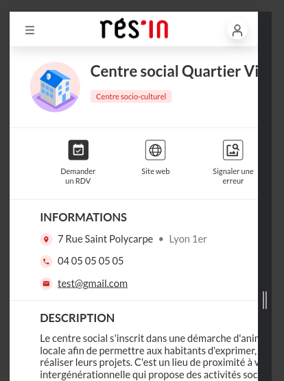
fix(ui) Width of structure details for mobile
Code
Review changes
Check out branch
Download
Patches
Plain diff
Merged
fix(ui) Width of structure details for mobile
fix/ui/mobile-structure-details
into
dev
Overview
0
Commits
2
Pipelines
0
Changes
1
Merged
Pierre Ecarlat
requested to merge
fix/ui/mobile-structure-details
into
dev
1 year ago
Overview
0
Commits
2
Pipelines
0
Changes
1
Expand
Related to
#435 (closed)
What does this MR do and why?
Fixes the width of structure-details panel
0
0
Merge request reports
Compare
dev
dev (base)
and
latest version
latest version
455b4118
2 commits,
1 year ago
1 file
+
11
−
0
Inline
Compare changes
Side-by-side
Inline
Show whitespace changes
Show one file at a time
src/app/structure-list/components/structure-details/structure-details.component.scss
+
11
−
0
Options
@@ -15,6 +15,7 @@
position
:
fixed
;
z-index
:
$structure-details-z-index
;
height
:
100%
;
width
:
100%
;
h1
{
@include
font-bold-24
;
@@ -37,6 +38,10 @@
width
:
600px
;
box-shadow
:
0px
12px
24px
0px
rgba
(
0
,
0
,
0
,
0
.1
);
background-color
:
$white
;
@media
(
max-width
:
600px
)
{
width
:
100%
;
}
}
// Default section styles
@@ -77,6 +82,12 @@ section.actions {
flex-direction
:
row
;
justify-content
:
space-around
;
overflow-y
:
auto
;
@media
(
max-width
:
600px
)
{
flex-wrap
:
wrap
;
row-gap
:
16px
;
}
.clickableDiv
{
text-align
:
center
;
max-width
:
65px
;
Loading